Bold iconographic design systems create brand awareness and adoption.
• Brand Strategy
• Visual Identity
• Icon Design
• Motion Graphics Design & Animation
• Copywriting
Build understanding around the efficacy of energy savings programs toattract adoption ofboth utility companies and energy consumers.
Articulate the simplicity of the energy savings platform through bold shapes and clean color palettes.
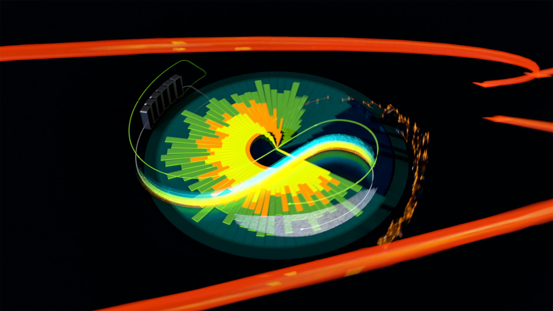
Energy saving should be easy. Simple and iconographic motion graphics quickly communicate the various ways consumers can save money on energy bills.

The growing software company neededa visual identityto attractutility providers and inform consumersof their web-based energy savings tools.The technology was built to bring savings to all customers &appeal to the planet-aware consumer. The new design system is elegantly crafted to highlight the energy savings and efficiency of the program and web-based tools.
We created core visual moments in the video and then built off of those to elucidate the full suite of web capabilities&appeal to the eco-sensitive consumer. We designed a series of branded iconography for the video inspired by PlanetEcostystem’s software interface.
We wanted to quickly describe the benefit and workings of the software through a visual language. We developed a mechanism of interconnected circles to represent the connected ability of the software, which allows for communication between utilities and their customers.
Energy is an intimate part of our lives, an essential means for productivity and progress. We kept the design elements welcoming and personal to echo the ever-presentneed for energy, balanced by a need to consume responsibly. Changing the way we consume energy is key to PlanetEcosystems’ mission. Creating a friendly, straightforward design language drove this message home to the B2B utility customer &B2C customer alike.


.png)